Most business people are aware of the concept of brand management. In a nutshell, it refers mainly to how a company’s brand imagery is used to ensure consistency. Everyone can agree that there is value in a brand; when strong brand standards are followed and the imagery is consistent, the brand becomes more recognizable and memorable, and therefore more valuable. On the other hand, inconsistent use weakens the value of the brand; seeing different versions of a logo makes it confusing and forgettable. (For some really good snippets on brand management, check out Cronin Creative’s blog at cronincreative.net.)
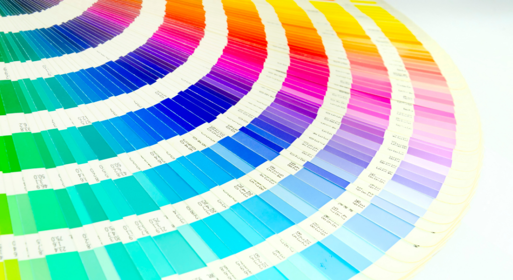
Pantone Guide
The best-known form of brand imagery is a company’s logo, often incorporating the company name (or a stylized version of it). When the professional designer created that logo, they designed it with specific colors, and those colors are part of the brand standard. Think about some iconic brands for which color is an important part of the image: Coke Red, IBM Blue, McDonald’s red and yellow… the golden arches just wouldn’t look right in different colors or even different shades. Companies that want to maintain their brand strength work hard to maintain brand integrity, and part of that is making sure the colors are always consistent and correct.
How Are Colors Specified?
Most professional brand design uses the Pantone Matching System® (PMS), a collection of over 10,000 colors curated by Pantone®. The brand standard will specify “Pantone® 2718” or “PMS 2718,” which corresponds to a particular shade of blue (2718 is IBM Blue, by the way). With that established, the blue IBM logo will always be IBM Blue.
Pantone colors, however, are not produced in the real world. Paint and ink can be custom blended to produce a specific color if the mixing system is programmed with Pantone colors, and while it’s the most accurate way to follow the brand standard, it’s really only practical for paint, and then only when painting whole objects (i.e., not the IBM logo).
Virtually all color printing today is a four-color digital process. Whether through a laser printer, ink jet printer, or offset printing, four colors – cyan, magenta, yellow, and black – are applied to the surface in precise ratios to appear as a custom color. The printer requires a CMYK color code to know how much of each (from 0 to 100), expressed as “CMYK 75 43 0 0” (that’s the CMYK equivalent of IBM Blue).
On-screen graphics are different altogether. Your computer screen mixes red, green, and blue to create colors, so it needs an RGB or Hex color code. IBM Blue is expressed as “RGB 75 107 175” or “#4B6BAF”. (The Hex code is just the RGB numbers restated in hexadecimal format.)
Piece of Cake – If I Give You One of Them, You Can Make Anything
Here’s where it gets tricky. (1) The different color specifications have different theoretical and practical ranges, and (2) there is no direct translation between the three specs. The CMYK and RGB codes noted above for IBM? Someone determined those are the closest approximations to Pantone 2718; they are not exact matches.
An astute designer will recognize that the brand image can be used in multiple media and will specify all three in the brand standard. One of our customers includes the image below in their brand standard, clearly noting what colors are to be used in each medium. We (and our cousins in the other brand-awareness trades) love that.
I Designed My Logo in PowerPoint (or Photoshop, or Online)
Chances are your resulting logo file contains RGB colors. Fear not, we can work with that. (By the way, unless your monitor has been calibrated, there’s a good chance the colors you chose are not what you think, and will probably look different in print.) A bigger problem with self-created logos is the file format; typically you end up with a .jpg or .png (raster format) file, which will not have the needed resolution and usually has corrupted colors. (See my blog on artwork quality for more information.)
This image was created from three simple colors, but when saved as a .jpg, the edges changed colors. Usually, when we receive a .jpg file, the corruption is much worse. The question is, which color is the correct one?
(Side note: I actually create the MetroCenter Signworks logo design in PowerPoint before I knew anything about color management. When I figured out it was not going to print as expected, I recreated it in proper design software, set the colors, and wrote the brand standard.)
What’s the Solution?
At MetroCenter Signworks we receive artwork in a variety of formats and a range of qualities. Sometimes it’s excellent, and the correct color information is embedded in the file. Sometimes the quality is poor, but we can almost always work with it. And sometimes we don’t get a working design, but a request to create a sign with the company colors. We’ll probably ask you one or more of these questions:
- Do you know the PMS colors (if the project will be painted)?
- Do you know the CMYK colors (if the project will be printed)?
- Do you have a written brand standard? That will tell us what we need to know.
Please understand that we’re not asking to make our jobs easier. We do it to make sure we are producing your brand imagery in line with your company’s standard, which (go back to the beginning of the story) strengthens your brand.
Want to Ensure Your Brand Is Represented Correctly?
Or maybe you just want to learn more about brand management, artwork quality, and color management? Call MetroCenter Signworks today for a free consultation at 615-649-5003, or visit MetroCenterSignworks.com.
FAQ
My logo features both blue and red colors. Can I still make a sign with these colors?
A: Absolutely! Incorporating red and blue colors into your sign design is completely achievable. Whether you have a blue logo or a red logo, or a combination of both, our team at MetroCenter Signworks can work with you to create a sign that accurately represents your brand identity. We specialize in custom sign designs and can tailor the colors, size, and style to match your logo specifications.
How are colors specified in brand standards?
Professional brand design typically utilizes the Pantone Matching System® (PMS), which assigns specific codes to colors. For example, “Pantone® 2718” corresponds to a particular shade of blue, such as IBM Blue.
What if I’ve designed my logo using software like PowerPoint or Photoshop?
Logo designs created in programs like PowerPoint often use RGB colors, which may not translate accurately to print or other mediums. Additionally, raster formats like .jpg or .png may result in color corruption and low resolution.
What’s the solution if I encounter color inconsistencies in my artwork?
When working with artwork of varying qualities, it’s crucial to provide accurate color information. We may ask for PMS colors for painting projects or CMYK colors for printing. Having a written brand standard ensures consistency and strengthens your brand identity.
How can I ensure my brand is represented correctly across different mediums?
For assistance with brand management, artwork quality, and color consistency, contact MetroCenter Signworks for a free consultation at 615-649-5003 or visit MetroCenter Signworks in Nashville, Tennessee.